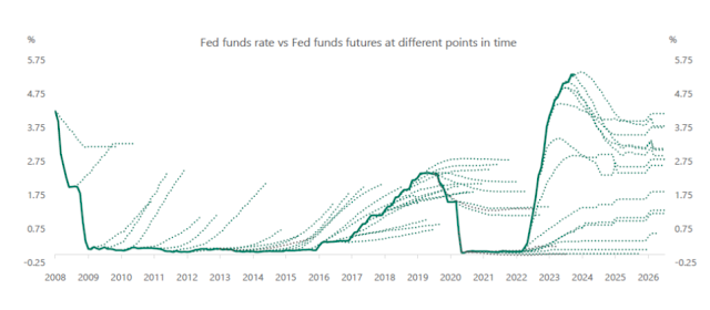
A lovely plot from the always interesting Torsten Slok. The graph shows the actual federal funds rate, together with the path of "expected" funds rate implicit in fed funds futures market prices. (Roughly speaking the futures contract is a bet on where the Fed funds rate will be at various dates in the future. If you want to bloviate about what the Fed will do, it's easy to put your money where your mouth is!)
A lot of graphs look like this, including the Fed's "dot plot" projections of where interest rates will go, inflation forecasts, and longer term interest rate forecasts based on the yield curve (yields on 10 year bonds imply a forecast of one year bonds over the 10 year period.) Just change the labels.
In words, throughout the 2010 zero bound era, markets "expected" interest rates to lift off soon, year after year. It was sort of like spring in Chicago -- this week, 35 degrees and raining. Next week will be sunny and 70! Rinse and repeat. Once rates started rising in 2016, markets actually thought the rise would be slower than it was, but then did not see the end of the rise. Of course they did not see the sudden drop in 2020, because they didn't see covid.
I find it fascinating that for the first full year of inflation, 2021-20222, markets did not price in any interest rate rise at all. The Taylor rule (raise interest rates promptly when inflation rises) wasn't that forgotten at the Fed! The one time when it made abundant sense to forecast the Fed would raise rates, markets did not reflect that forecast.
When the Fed finally did start to raise rates, amid raging inflation, the market even more curiously thought the rate rises would stop quickly. This being a pasted graph, I can't easily add inflation to it, but with the federal funds rate substantially below inflation until June 2022, it's interesting the markets thought the Fed would stop. The story of "transitory" inflation that would go away on its own without a repeat of the early 1980s -- without interest rates substantially below inflation -- was strong.
The market forecast seems to me still remarkably dovish. GDP just grew like gangbusters last quarter, and the Fed believes in the Phillips curve (strong growth causes inflation). We're running a historic budget deficit for an economy at full steam. The Taylor rule (interest rates react to inflation and output) is still a pretty good description of what the Fed does, sooner or later. So, if you were to trade on the historical pattern, you would bet on rates falling much more quickly than forecast. Hmm.
This is an old phenomenon. The "expectations" in market forecasts don't seem right. Don't jump to fast to "irrational," finance always has a way out. We call it the "risk premium." There is money to be made here, but not without risk. If you always bet that the funds rate will be below the futures rate, you'll make money most of the time, but you will lose money on occasion. First, in many such bets the occasional losses are larger than the small regular gains. That is important, because the pattern of constant misses in the same direction suggests irrational forecasts, but that's not true. If you play roulette and bet on anything but 00, you win most of the time, but lose big on occasion and come out even overall, More plausibly, when you lose you lose at times when it is particularly inconvenient to lose money.
Economists often use the federal funds future to establish the "expected" federal funds rate, and then any movement including no movement at all counts as an "unexpected" shock. By that measure the early 2010s were one series of "unexpected" negative monetary policy shocks, month after month. The graph makes it clear that's a reading of history that needs some nuance in its interpretation.
from The Grumpy Economist https://ift.tt/0ltdHGA

0 comments:
Post a Comment